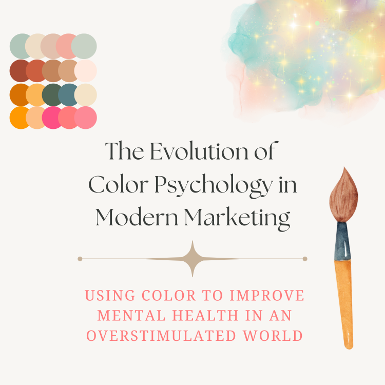
Introduction
The use of color can evoke emotional responses in us, prompting us to feel a certain way each time we see a brand or product we recognize. Whether it makes you feel nostalgic and warm and fuzzy inside (such as the Snuggle bear), or you feel pumped up and energized (Red Bull, Monster, Liquid Death, anyone?), colors play a pivotal role in how we navigate our days. Even if we don't always realize this phenomenon.
Color psychology blends culture, biology, and personal memory. They've been used to present solutions, drive sales, and even evoke fear in the heart of consumers when dealing with real-life emergencies, pest infestations, or natural disasters.
Marketers weaponized that insight long before academia caught up, painting discounts in red and luxury in black. Today, the same research is being flipped to reduce arousal in a world of screen fatigue. Using the same logic, colors should be just as effective at calming and centering an individual.
"In one survey of 549 students with sensory processing disorders—including ADHD and ASD—muted greens and blues beat vivid reds and yellows for comfort and focus."
Do you know someone (or maybe you are the someone) who can't seem to remain focused in a fluorescent-lit office space? Maybe it's not "all in their head", but rather actually wired into their brain, instead.
In recent years, researchers have discovered that flicker-free lighting combined with low-stim colors can make all the difference.
What is Color Psychology?
Color psychology is more prevalent than ever in marketing efforts today. With advanced research journals and studies conducted, it's becoming easier to better understand just how color impacts how we see and experience the world. Color psychology is a combination of cultural, psychological, and biological factors (Insights Psychology).
While culture and location significantly impact how colors are used and interpreted, there are also universal patterns that surpass constructs we have created as a society and across international timelines and borders.
Basic Colors and Meanings
Interestingly enough, individuals tend to categorize the use of "black" and "white" into positive and negative categories automatically. Let's take a look at basic color meanings that cross cultures and borders:
| Color | Swatch | Positive Associations | Possible Negatives / Cautions |
|---|---|---|---|
| Red | Energy, passion, urgency, appetite‑stimulant | Can trigger anxiety, anger, impulse‑buying | |
| Orange | Creativity, friendliness, affordability | May feel "cheap" or brash if overused | |
| Yellow | Optimism, warmth, attention‑grabbing | High‑chroma tones can cause visual fatigue, anxiety | |
| Green | Harmony, growth, biophilia, calm focus | Certain dark greens can feel stagnant or dated | |
| Blue | Trust, reliability, serenity, corporate stability | Excess cool blue at night may disrupt melatonin | |
| Purple | Creativity, luxury, spiritual depth | Overuse can feel artificial or elitist | |
| Pink | Compassion, playfulness, soothing (soft pastels) | Hot pink can be overstimulating for some viewers | |
| Brown | Earthy stability, reliability, warmth | Can read as dull or heavy without contrast | |
| Grey | Neutral balance, sophistication, "visual white‑noise" | Too much can feel cold or lifeless | |
| Black | Power, luxury, high contrast, authority | May signal menace, sorrow, or heaviness | |
| White | Purity, simplicity, spaciousness | Excessive brightness can cause eye strain; feels clinical |
How Can We Improve Quality of Life with Color & Design?
- Remain mindful of color selections in offices, branding materials, and promotional advertisements. Use color with intention. Rather than evoking fear to purchase, shift color designs to connect and grow loyalty among audiences.
- Choose colors intentionally when designing interior spaces. Consider how color evokes certain emotions. Incorporate bright colors for creative spaces, and muted pastels in spaces for calm, welcoming vibes. Consider neurodivergence when selecting color palettes.
- Switch from flickering fluorescents to 2700–3000 K, flicker‑free LEDs.
- Trade high‑chroma wall paints for low‑stim palettes.
- Layer indirect light and give occupants dimming + palette choice; autonomy itself lowers anxiety for many neurodivergent people.
"Amber LEDs after 8 p.m. shortened sleep‑onset by ~30 min in teens with ADHD."
Digital Detox Palette Ideas
Below are six turnkey palettes (plus hex codes) that keep chroma down and comfort up.
| Palette | Swatches (HEX) | Mood / Effect | Best Use‑Cases |
|---|---|---|---|
| Misty Lilac | Pastel calm, lowers visual contrast | Break‑rooms, meditation apps, pastel UI "zen" themes | |
| Forest‑Bath | Biophilic, grounding, focus aid | Focus pods, nature‑themed dashboards, plant‑filled lobbies | |
| Greige Cocoon | "Visual white‑noise," neutral & sophisticated | Slide decks, open‑plan partitions, minimalist landing pages | |
| Soft‑Slate | Cool, steady, reduces screen fatigue | Dark‑mode UI, e‑sports lounges, VR therapy booths | |
| Clay‑Hearth | Earth‑warmth, grounding, reduces night‑time anxiety | Bedrooms, trauma‑informed shelters, evening phone UIs | |
| Circadian Shift | Dynamic: cool‑day → warm‑night, respects melatonin cycles | Tele‑therapy apps, smartwatch faces, conference rooms with tunable light |
Tech‑Forward Applications
- Circadian logos & dashboards – SVG marks warm from slate‑blue to taupe after sunset, cutting blue‑light glare.
- Phase-change wall paint – Thermochromic panels fade from grey to taupe above 24 °C, cueing sensory breaks.
- Dopamine‑dosing dashboards – Swap panic reds for warm coral to reduce alert fatigue.
- Amber smart‑home scenes – Rooms auto‑shift to 2200 K at 20:00; tests show faster melatonin rise (Chang et al., 2021).
- UV‑quiet way‑finding – Near‑UV floor strips guide ASD students without loud primaries (Jiang et al., 2020).
- Sleep: Blue‑blocking protocols improve sleep efficiency by 18 % in ADHD cohorts (meta‑analysis, 2021).
- Anxiety: Low‑saturation palettes dampen sympathetic arousal (Khan, 2024).
- Energy: Warm LED retrofits trim HVAC load—amber chips emit less radiant heat (DOE, 2023).
- Audit glare, flicker, dominant hues.
- Retrofit fixtures to flicker‑free, warm LEDs.
- Reskin UIs with Greige or Forest‑Bath themes.
- Pilot one Circadian meeting room and survey staff.
- Provide choice—palette and dimming controls.
- Print or screenshot yesterday’s screen‑time report.
- Highlight the three apps/sites with the most “doom‑scroll” minutes.
- Circle the hours when notifications felt most distracting.
- Select a quiet spot; add one calming‑palette item (e.g. Forest‑Bath cushion or Rose‑Lilac lamp).
- Swap harsh overhead bulbs for a 2700 K desk lamp.
- This becomes your daily check‑in zone for the rest of the plan.
- Turn on grayscale or focus mode for the first 30 minutes after waking.
- Schedule a do‑not‑disturb window that ends before your peak‑energy time.
- Group social apps in one folder; disable badge counts.
- Set two 10‑minute “catch‑up” slots (e.g. 12 p.m. & 7 p.m.).
- Use a visual timer—count‑down graphics help predict transitions.
- Replace panic‑red alerts with warm coral via accessibility colour filters.
- Enable night light / blue‑filter from sunset to sunrise.
- Wear amber glasses if screens are unavoidable after 8 p.m.
- Brown, L., & Lee, S. (2023). Thermochromic coatings for human‑centric buildings. Journal of Smart Materials, 5(2), 45–59.
- Chang, A.‑M., et al. (2021). Evening use of amber light and sleep onset in adolescents with ADHD. Sleep Medicine, 88, 150–158.
- Department of Energy. (2023). Amber LED Retrofits: Energy & Thermal Performance Fact Sheet.
- Jiang, W., Hughes, M., & Patel, K. (2020). Near‑UV floor guidance systems for low‑vision and neurodivergent travelers. Aviation Lighting Review, 42(1), 33–40.
- Khan, I. A. (2024). Psychology of color, integration of local culture and the effect of infographics on English language learning. PSU Research Review, 8(1), 84–101. https://doi.org/10.1108/PRR-02-2021-0013
- Nair, A. S., Priya, R. S., Rajagopal, P., et al. (2022). The effect of light and colour in the built environment on autistic children’s behaviour. Frontiers in Psychiatry, 13, 1042641.
- Tavassoli, T., et al. (2014). The Sensory Perception Quotient (SPQ): Assessing sensory hypersensitivity in adults with autism. Molecular Autism, 5, 29.
- UI Trends Report. (2024). Calm Colors and Attention in Enterprise Dashboards.
Health, Productivity & Sustainability Wins
What is Chromotherapy?
Ancient Egyptians filtered sunlight through coloured gems; Ayurveda paired hues to doshas. Modern chromotherapy tools—narrow‑band LED panels, VR sunset domes—are putting numbers to those intuitions (HRV, salivary cortisol). While no panacea, structured exposure to calming hues is inching toward mainstream behavioral medicine.
Quick‑Start Checklist
Step‑By‑Step Digital Detox for ADHD & Autistic Brains
Each action is bite‑sized—about 15 minutes or less—so it won’t overload busy or sensory‑sensitive minds.
Day 1 – Map Your Digital Triggers
Day 2 – Create a Low‑Stim “Reset Corner”
Day 3 – Install Soft Barriers
Day 4 – Batch Notifications
Day 5 – Sensory Swap‑Out
Weekly Tech‑Free Micro‑Ritual
Choose one low‑arousal activity—puzzle, nature walk, knitting, etc. Commit to 60 minutes each Sunday; jot a quick mood note before/after. Consistency beats intensity for neurodivergent nervous systems.
Pro tip: ADHD brains crave novelty—swap activities or rotate palette objects monthly to keep motivation high without re‑introducing visual chaos.
Conclusion
Color psychology isn't just for marketing—it's a powerful tool we can use to improve our everyday lives. By understanding how different colors affect our mental state, we can create environments that promote wellbeing, focus, and comfort. Whether you're designing a workspace, home environment, or marketing materials, considering the psychological impact of your color choices can make a significant difference in how people experience and interact with your space or brand.